Shifting from Access to Livelihood
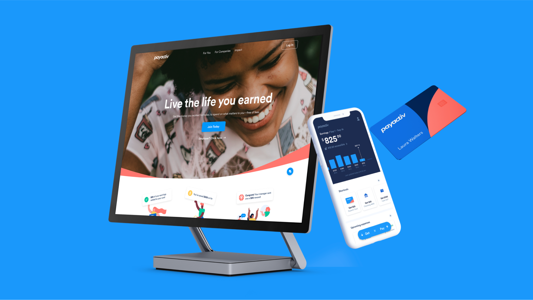
Payactiv is a fintech startup that pioneered the Earned Wage Access (EWA) space in 2012, providing an alternative to payday loans, credit card interest and overdraft fees, that exploit hourly workers. As a B2B2C benefit company that partners with more than 1K employers, Payactiv provides access to earned wages to 1M workers.
Payactiv
6 Weeks — Illustration, App Design
frog Design, 2021
Challenge
Payactiv, as a global leader in Earned Wage Access space, is now challenged by an aggressive competition. Payactiv's offering has been associated with stigma by the main buyers, and their messaging and identity obsessed over the problem more than the solution, making their value proposition confusing.

A broader user reach and engagement
A broader user reach and engagement
After completing a new Brand Vision & Strategy, frog focused on the Payactiv app. The Payactiv App is its main user touchpoint. Knowing that Earned Wage Access’ functional value already connects with current users, we put our effort into creating a clear and focused experience that converts visitors into users and engages every step of the way.

My Role
As part of the app team, I collaborated on evolving the brand identity and developing a foundational design language system. However, my main task was to create an extensible illustration system that the Payactiv team could easily adopt and implement across all platforms.
As part of the app team, I collaborated on evolving the brand identity and developing a foundational design language system. However my main task was to create an extensible illustration system that the Payactiv team could easily adopt and implement across all platforms.
Defining the Illustration style
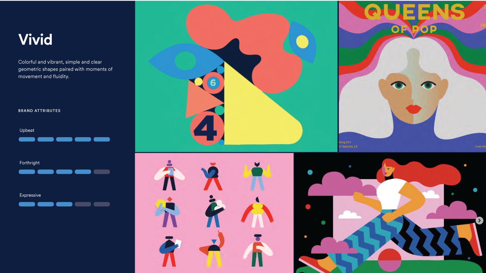
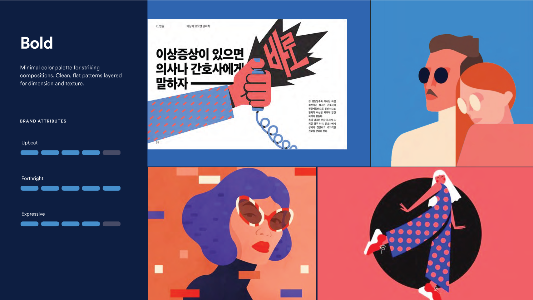
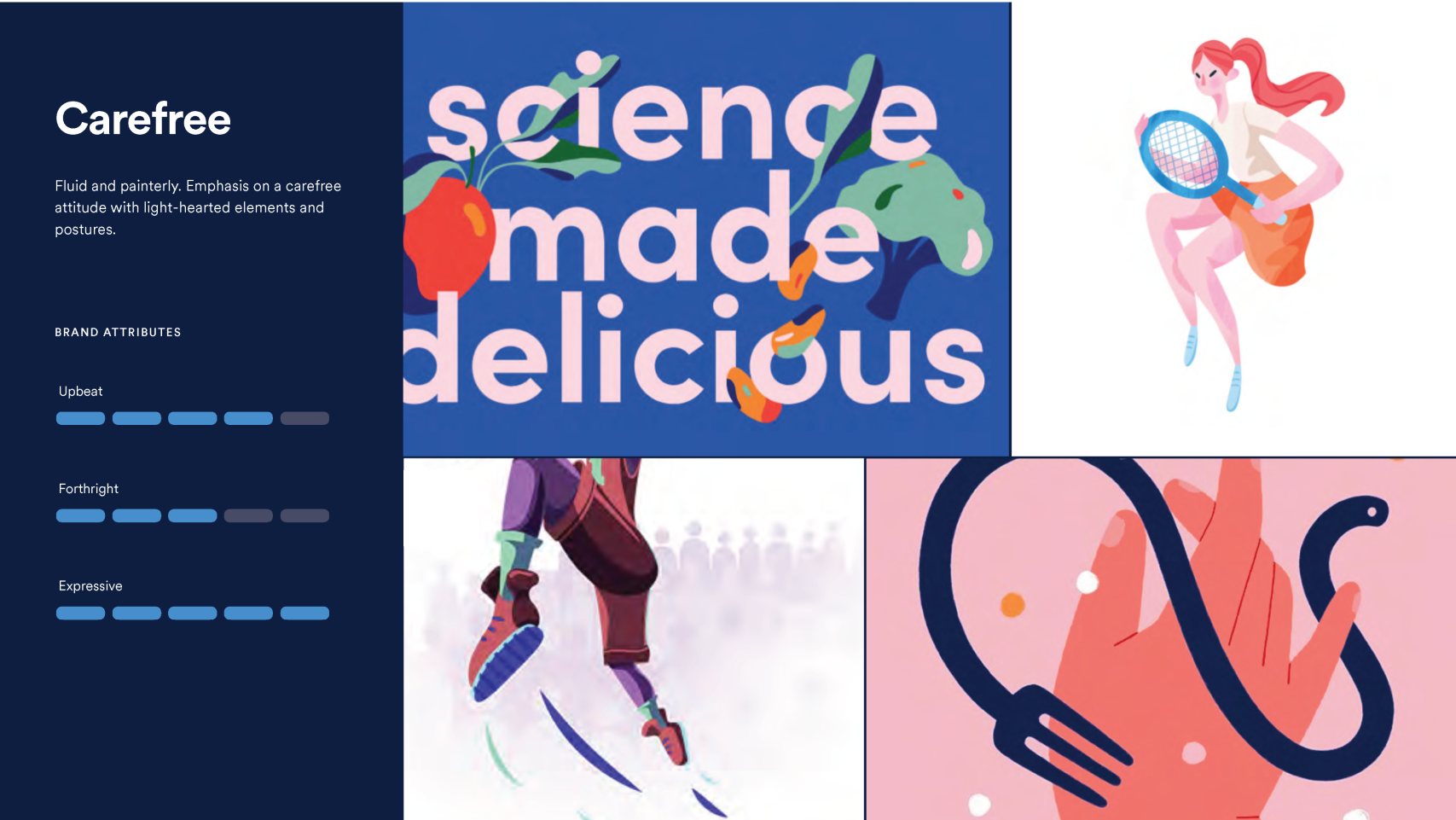
With the new brand strategy, voice, and personality defined. I sought to create an illustration style that would complement and help humanize the brand. I used the brand attributes (Upbeat, Forthright, and Expressive) as vectors to explore different styles starting with moodboards.
The Third Person Perspective
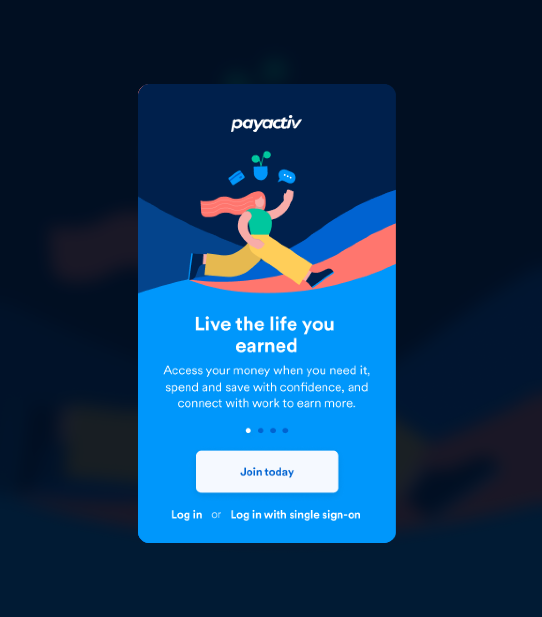
After evaluating an example user journey I realized that there was an opportunity to feature multiple perspectives depending on the user’s stage in the app journey, their task, and their emotional state.
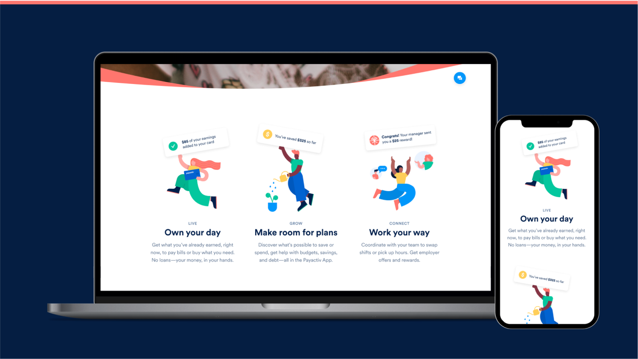
For example, before the user has logged in, we feature a zoomed-out perspective of a person going through life with its webs and flows. This broader perspective is used to illustrate marketing messages as a user slowly approaches this world.
The First Person Perspective
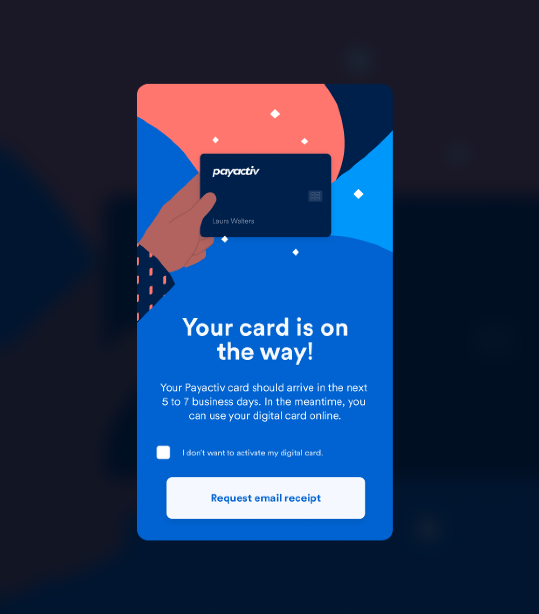
As the user dives deeper into the context of the actual experience, a zoomed-in first-person perspective is used. When the user interacts with the products and the features, they are shown the immediate value of their interactions. The intent is to congratulate and reward them for their choices. In this context being more immediate and straight to the point helps the user feel in control and empowered.


Delivering a System
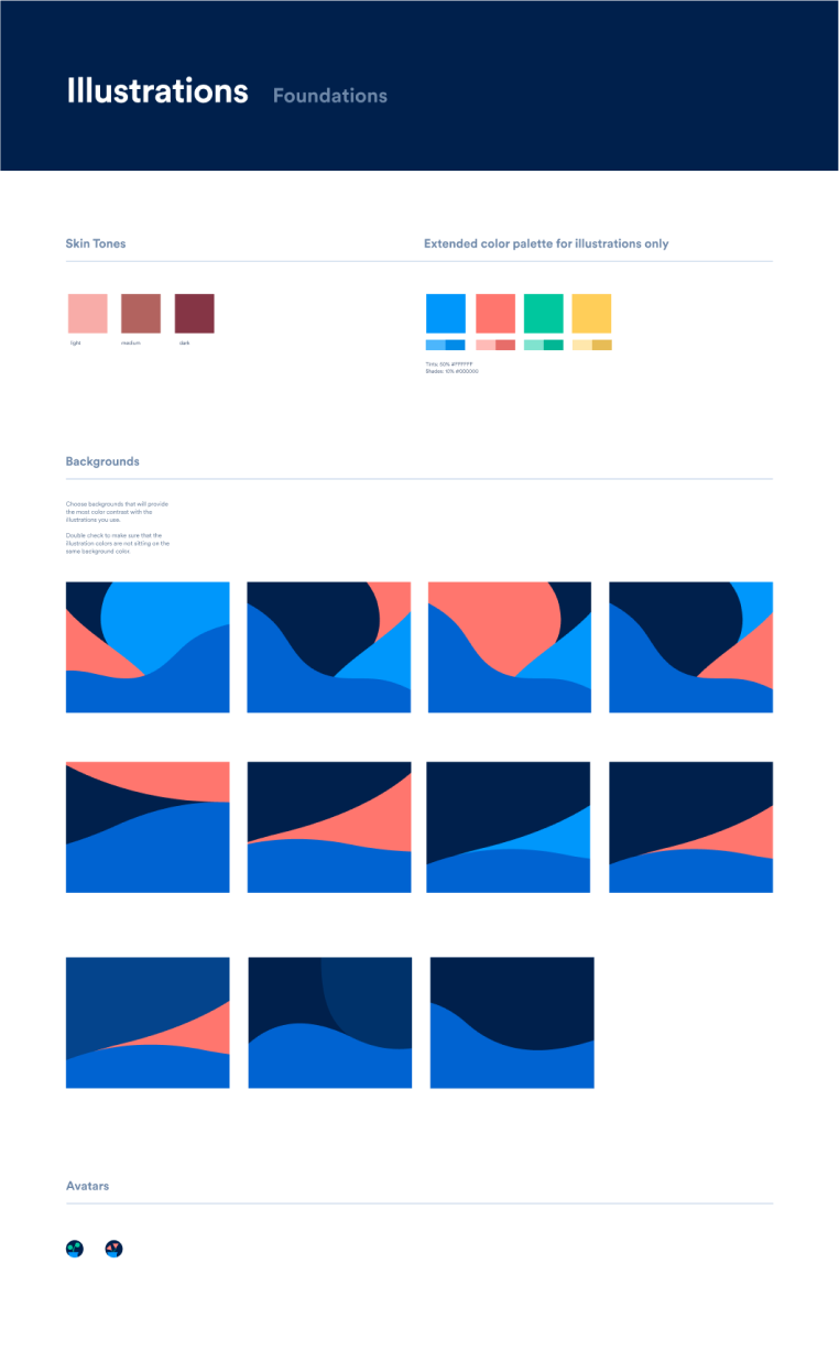
Inspired by Pablo Stanley's illustration systems, I delivered rules and guidance to create new custom illustration compositions as part of the Payactiv design language system. Doing the upfront work of creating a swappable library gave Payactiv a scalable system to continually add to the library.
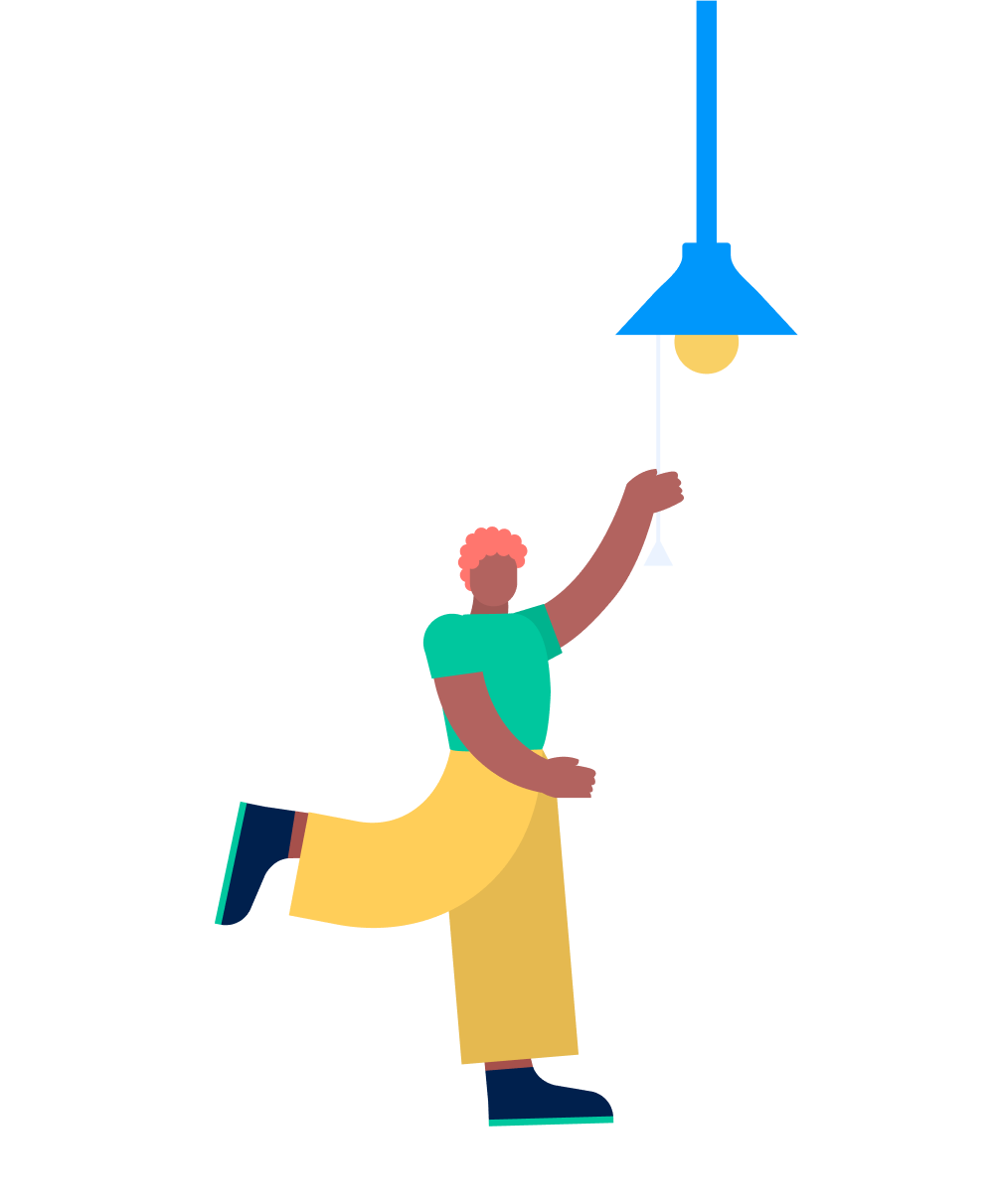
The third-person perspective includes the ability to change multiple attributes within one master component:
• An array of skin tones
• Hairstyles
• Arm movements
• Objects
• Leg movements
• Backgrounds
App launch and beyond
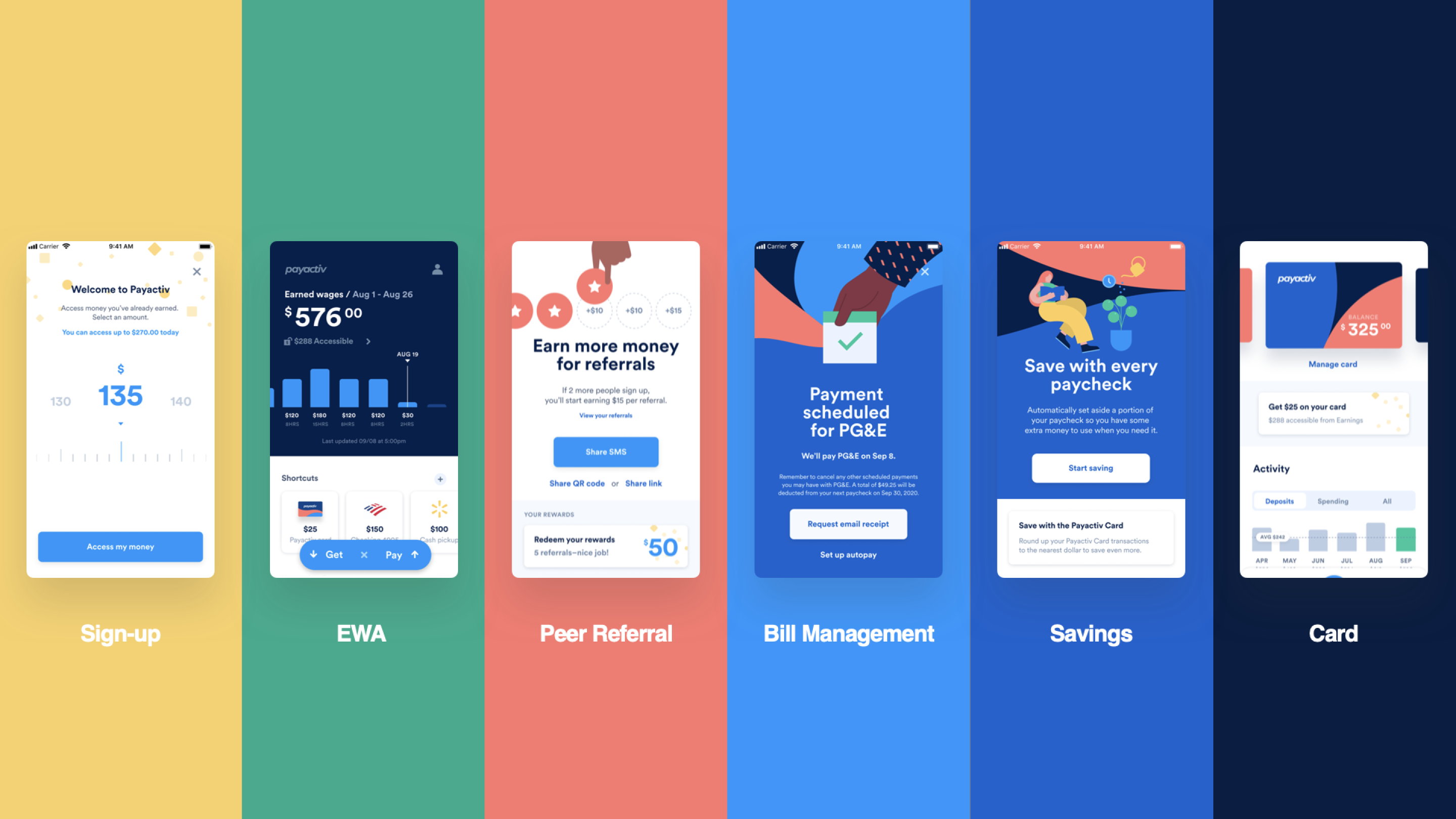
At the end of the program, we delivered a DLS and full-motion prototype that Payactiv was able to implement and launch successfully.
As frog and Payactiv continued their engagement to design the website, the new team of designers was able to quickly leverage my system and build new illustrations within the website narrative. This created cohesion between the app and website while saving time and effort.
