Your mobile guide at the museum
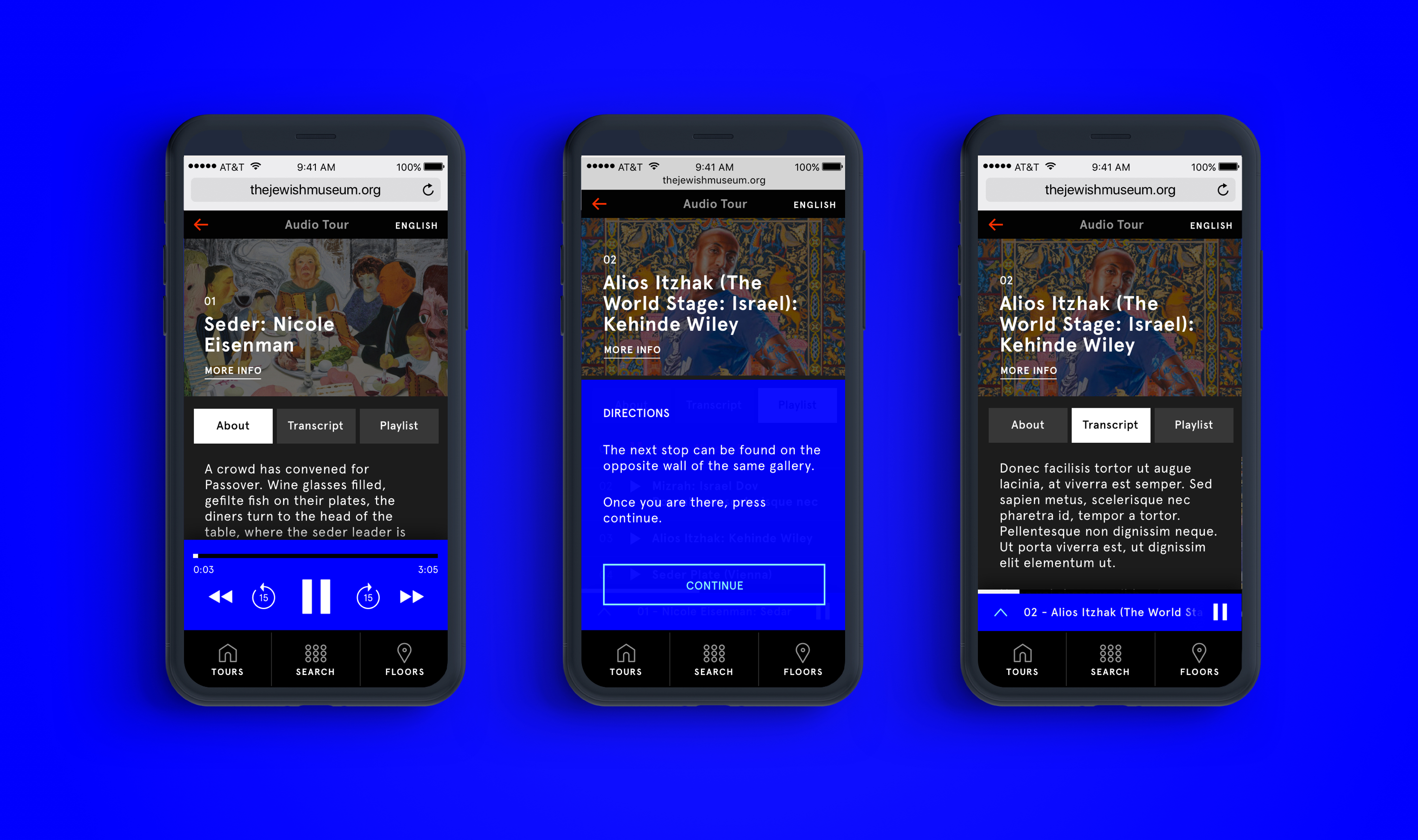
The Jewish Museum in NYC sought to enhance its visitors' experience by replacing clunky audio tour devices with a more streamlined mobile system. Our team drew upon the vibrant visual language established by Sagmeister and Walsh in the existing brand and adapted it to fit this new platform. By creating a web app accessible on visitors' mobile or tablet devices during their on-site museum visit, we provided an efficient and user-friendly audio tour solution.
The Jewish Museum
15 weeks — Audio Tour Web App
Code & Theory, 2018
Approach
In developing the user interface, our goal was to optimize the audio experience rather than be duplicative of what visitors would be seeing in person. Instead of using the artwork images as the primary focus, we emphasized the audio controls. To guide users smoothly from one tour to the next, we included subtle audio and UI cues that serve as prompts. Supplementary information about the museum is also available but presented in a way that does not detract from the visitor's surroundings, allowing for a seamless experience.
We used UI elements that are minimal yet maximize the best use of screen real estate. Instead of artwork images being top in hierarchy, we focused on the audio controls. We introduced nudges of audio and UI cues to lead the user from one tour to another. Additional information about the museum act as a supplemental aid for visitors without distracting them from their surroundings.
Role
As the lead visual designer on this project, I was responsible for designing all necessary screens, animating and prototyping interactions, and collaborating closely with our development team to execute our ideas. I provided comprehensive annotations and style guides to ensure consistency and clarity throughout the project. I also conducted thorough QA testing after the build was completed.
